A good retail layout doesn’t feel random. Customers should move through the space without needing to think about where to go next. When the layout works, people naturally browse longer and see more products without feeling overwhelmed.
When it doesn’t work, customers stick to the front of the store, miss entire sections, or leave faster than expected.
The Layout Should Create Flow
A lot of stores place fixtures wherever space is available instead of thinking about movement patterns.
That usually creates:
- blocked sightlines
- awkward walkways
- sections customers skip entirely
Fixtures should guide movement, not interrupt it. Wider paths near entrances and cleaner transitions between sections help customers move deeper into the store without hesitation.
Different Zones Need Different Fixture Types
Not every section should feel the same.
High-volume product areas can use open shelving or racks because customers browse them quickly. But feature sections often need more structure and controlled presentation.
This is where commercial display cases fit well into a retail layout. They help slow customers down around featured products while still keeping the overall floor organized. Instead of blending into standard shelving, they create natural focal points inside the store.
That variation helps break up the space visually without making it feel cluttered.
Avoid Creating “Dead Walls”
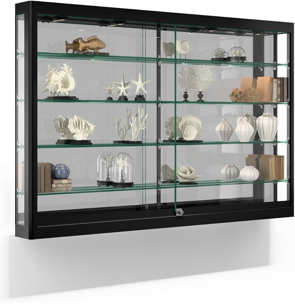
Long walls filled with identical shelving usually become background.
Customers scan them quickly without really focusing on individual products. Breaking up those sections with featured displays, lower fixtures, or spacing changes helps keep the area more visually active.
Even small changes in fixture height or layout can improve engagement.
Keep Key Products in Transition Areas
Transition zones are the spaces between major departments or categories.
These areas are often underused, but they’re important because customers naturally slow down there while deciding where to go next.
Feature products, seasonal items, or promotional displays tend to perform well in these spots because they catch attention during those pauses.
Don’t Let Fixtures Dominate the Floor
Retailers sometimes focus so much on maximizing display capacity that the store starts feeling crowded.
Customers need open visual space too. If every part of the floor is filled with tall fixtures, the environment becomes tiring to browse.
Leaving some breathing room:
- improves sightlines
- reduces visual stress
- makes key displays stand out more
A cleaner layout often leads to better browsing behavior than simply adding more inventory to the floor.
Think About Visibility From Multiple Angles
Displays shouldn’t only work from straight ahead.
Customers approach fixtures from different directions, especially in open floor plans. Products hidden behind signage, stacked too tightly, or blocked by taller units lose visibility quickly.
Good layouts allow products to stay visible from several angles without needing customers to step directly in front of the display first.
Keep Maintenance Realistic
Some layouts look good in photos but become difficult to maintain during normal business hours.
Complicated displays usually fall apart faster:
- products get misplaced
- cleaning takes longer
- restocking becomes awkward
Practical layouts stay consistent because staff can manage them easily throughout the day.
What This Comes Down To
Retail layouts work best when they guide customers naturally instead of forcing attention through clutter.
A mix of open fixtures, focused feature areas, and clear movement paths creates a store that feels easier to browse — and stores that feel easier to browse usually perform better over time.
Categories: Shopping
